I was really inspired by the Philip Guston show at Tate. The exhibition is filled with paintings, drawings and prints from across Guston’s career which are energetic, bold, bright, weird and fun. I’ve always been fascinated by how Guston developed his personal style and visual language and the show is a great opportunity to explore the evolution of his artwork.

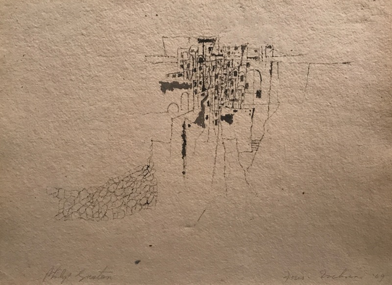
I was blown away with the revelation that this little sketch was a hugely important and pivotal turning point in Guston’s work. ‘Drawing No. 2 (Ischia), 1949’, was a starting point and key influence which inspired him to explore abstract painting. The delicate drawing is a sketch of a small Italian town made with a reed he found on the beach and bottle of ink he was carrying. It is a simple line drawing which captures the architectural forms of the town but something in the contained energy of the tightly packed lines, arches and rectangular forms inspired Guston to explore these visual elements further.

He developed ideas from the drawing during the rest of his career and a series of abstract paintings on display in the same room show how he expanded his exploration of contained energy and space. These paintings also include central areas of tightly packed forms which, like the drawing, expand and extend outwards to areas of emptiness at the edges of the pictures. Guston used expressive brush work to build localised areas of brightly coloured oil paint and rectangular forms. The energetic brush marks and bright colours disperse into cooler colours towards the edges of the pictures. This contrast between contained areas of energy and comparative emptiness was really compelling.

Guston’s later style developed into something that looks like cartoon art. It became more bold, graphic and filled with symbols and motifs. Although he came to depict a wider variety of subjects in his later work, the influence of the Italian town sketch is still strong. In ‘City, 1969’, multi-storied buildings overlap each other in the centre of the picture and they are surrounded by energetically painted pink paint.
It was amazing to discover how a quick sketch became the genesis for some of Guston’s most famous artwork and a catalyst for the rest of his career. It was also inspiring to learn how he continued to work and develop his style through personal tragedies and turbulent social circumstances. Guston was an artist who was always reworking and questioning. He seemed able to look forwards, backwards and still react to the present situation.
For more info please visit;
